N2 scalable design system for ERP's
N2 scalable design system for ERP's
N2, is a Design system that was build for developing consistent design for all ERP dashboards designed at nathan digital, it was build to be scalable, cohesive & efficient. The creation of the N2 design system became crucial for adapting to the growth the company and expanding digital projects. Not only did it make development more efficient, but it also accelerates the design process, ensuring the digital products to be consistent.
N2, is a Design system which build for developing consistent design for all ERP dashboards designed at nathan digital, it was build to be scalable, cohesive & efficient. The creation of the N2 design system became crucial for adapting to the growth the company and expanding digital projects. Not only did it make development more efficient, but it also accelerates the design process, ensuring the digital products to be consistent.
Research
Design & Prototype

My role
My role
Lead Designer
Lead Designer
Timeline
Timeline
Oct 2023 - Jan 2023
Oct 2023 - Jan 2023
Team
Team
3 Designers
3 Designers
Why N2 design system?
Why N2 design system?
The old dashboard design doesn't meet the quality of being a global product. Our goal was to upgrade the overall look and feel of the dashboard with a focus on being more business-oriented. I encountered numerous inconsistencies in the user interface, causing a lack of cohesion and a weakened brand identity especially when the team grew in number. As Nathan digital company evolved, the necessity for a design system became even more evident without a design system, maintaining a consistent look and feel across these diverse products would have been impossible.
The old dashboard design doesn't meet the quality of being a global product. Our goal was to upgrade the overall look and feel of the dashboard with a focus on being more business-oriented. I encountered numerous inconsistencies in the user interface, causing a lack of cohesion and a weakened brand identity especially when the team grew in number. As Nathan digital company evolved, the necessity for a design system became even more evident without a design system, maintaining a consistent look and feel across these diverse products would have been impossible.
What we achieved?
What we achieved?
N2 design evolution embraces WCAG-guided contextual colors, a refined responsive type system, and a researched set of components. By prioritizing accessibility, optimizing typography, and streamlining assets, we've cultivated brand consistency through a modular system. This not only mitigates design challenges but also ensures a more efficient and visually compelling user experience.
N2 design evolution embraces WCAG-guided contextual colors, a refined responsive type system, and a researched set of components. By prioritizing accessibility, optimizing typography, and streamlining assets, we've cultivated brand consistency through a modular system. This not only mitigates design challenges but also ensures a more efficient and visually compelling user experience.
By comparing before and after the design system implementation, we witnessed a significant metrics growth as follows:
By comparing before and after the design system implementation, we witnessed a significant metrics growth as follows:
Design time
Design time
23% Reductions
23% Reductions
Design conversion
Design conversion
48% Increase
48% Increase
Reusability ratio
Reusability ratio
79% Increase
79% Increase
What did I do
✴︎ Research
✴︎ Component Library
✴︎ Style Guide
✴︎ Design Tokens Integration
✴︎ Optimization
✴︎ Iterations
✴︎ Documentation
Design System map
“I wisely started with a map.” ― J.R.R. Tolkien
With this concept in Design System, it allowed us to take better decisions when it comes to modifying, updating, and evolving our system. A map provides us with a sense of location and a better understanding of where we are and where we want to go. What are the smallest pieces? How many components and patterns do we have? How many elements can we identify?
Understad
Align
Optimize
The concept of Atomic design
It wasn't just about designing components; it was about building a whole design system and understanding the core concepts. out of all the core concepts the atom-molecule and organism concept helped me have a bigger picture on how to build a scalable design system.

Core principles
Consistency
Maintaining consistency in elements like colors, typography, spacing, and interactions throughout the system fosters a cohesive and predictable user experience
Modularity
Developing reusable, interchangeable components ensures consistency and scalability. This approach streamlines updates, improves collaboration, and supports effective implementation.
Accessibility
Prioritizing accessibility ensures that all users, including those with disabilities, can fully engage with the product. This involves considering factors like color contrast and other essential accessibility features.
Flexibility
While consistency is essential, a design system should also allow for flexibility to accommodate different contexts and use cases. By enabling customization and adaptation, the system can effectively meet diverse needs.
Laying the foundations
One of the first tasks was deciding on foundations like typography, color palette, grid & layout. I presented a few options to the Leadership team, aiming to encapsulate a modern, vibrant brand while also taking into account the delicate state of mind of the end user.
Typography
We choose Figtree font due to its well-suited alphanumeric characters, clean design and clear letterforms. This font provides excellent legibility across various screen sizes and resolutions, making it ideal for dashboard.

Colors
In quest to simplify design decisions, Redefined color palette experience. Alongside a diverse array of colors, which offer recommended foreground and background pairings.. Incorporated WCAG passing levels for each color, ensuring accessibility is a breeze.

Grids
We implemented an 8pt spacing, 12 column grid system throughout the design, ensuring consistency and harmony in all elements. Additionally, we adopted a flexible grid system that allows for adaptability and precision, enhancing the overall layout and user experience.

Design tokens
We implemented a variable token architecture for N2, consisting of primary and semantic variables. This approach was crucial for us to achieve our goals like:
Consistency: Design tokens serve as a single source of truth for design properties like colors, typography, and spacing, ensuring uniformity across the system.
Scalability: As the N1 design system grows and evolves, maintaining consistency becomes more challenging. Design tokens offer a scalable solution by abstracting design properties into reusable, manageable elements.
Efficiency: Centralizing design properties within tokens allows designers and developers to work more efficiently.

Asynchronous communication
A set of components is not enough to maintain a successful Design System there needs to be enough context to make it accessible for a range of internal users. I aimed where possible to
Provide rationale behind my design decisions (in conversations with the Leadership team)
Showcase behaviour, interactions and various states (in handover for the developers)
Cite research sources and alternatives considered (for future designers & wider Product team)
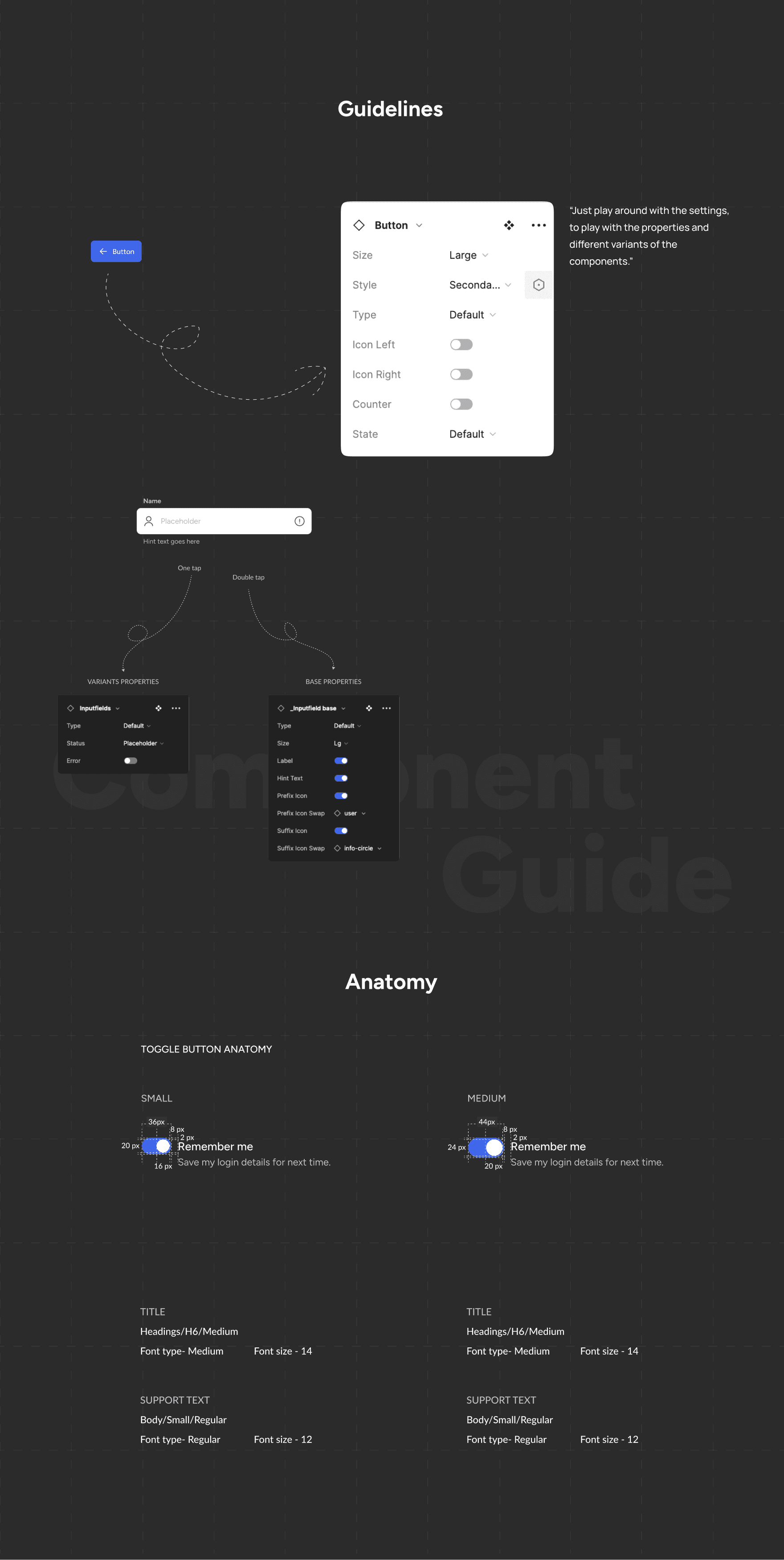
Components
When developing a design system, it must enable users to perform all intended actions. By creating components with all possible variants, instances, and necessary properties, we can ensure seamless and efficient use of each component.


Guidelines
Our design system guidelines keep everything consistent and efficient. New developers can ramp up faster, with the clear guidelines and component libraries.
Is this made any impact? Yes
The design system brought about a remarkable improvement in the consistency of our ERP products. By establishing a unified visual language and design principles, it ensured that every component and interface adhered to a cohesive style, reinforcing our brand identity.
By comparing the time it took for team members to design a specific number of screens before and after the design system implementation, we witnessed a significant 23% reduction in design time.”
The Reduction in design time not only highlighted the system's impact on efficiency but also underscored its practical value in streamlining our workflows in shipping design.
Due to the storybook plugin in figma those ready components played vital role in quick and consistent design conversion.
Next steps
✴︎
With the help of Figma's design system analytics tool we deep dive in to our library and monitored the usage of our components to enhance & optimize our library.
✴︎
We removed and redesign few components based on this insights for better optimized design system.
For a detailed view of the case study, please access it on your desktop 🙂
Let's discuss more with coffee!
Have an opportunity, wanna collaborate on something cool or just say hello!
Ishaqami47@gmail.com
Ishaqami47@gmail.com
Let's discuss more with coffee!
Have an opportunity, wanna collaborate on something cool or just say hello!
Ishaqami47@gmail.com
Ishaqami47@gmail.com
Let's discuss more with coffee!
Have an opportunity, wanna collaborate on something cool or just say hello!
Ishaqami47@gmail.com
Ishaqami47@gmail.com